Ramus Premium Olive Oil
Branding & Packaging for premium olive oil
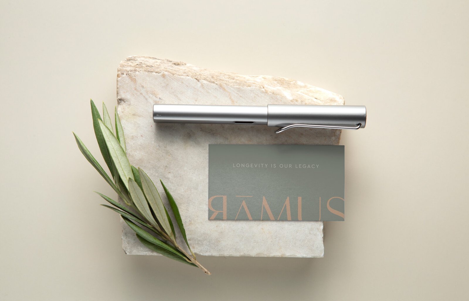
Ramus Premium Olive Oil is a tribute to elegance, quality, and tradition, originating from the renowned olive groves of Kalamata. The brand’s name, “Ramus,” is derived from the Latin word meaning “branches,” symbolizing the olive tree’s essence, its heritage, and its deep-rooted connection to nature.
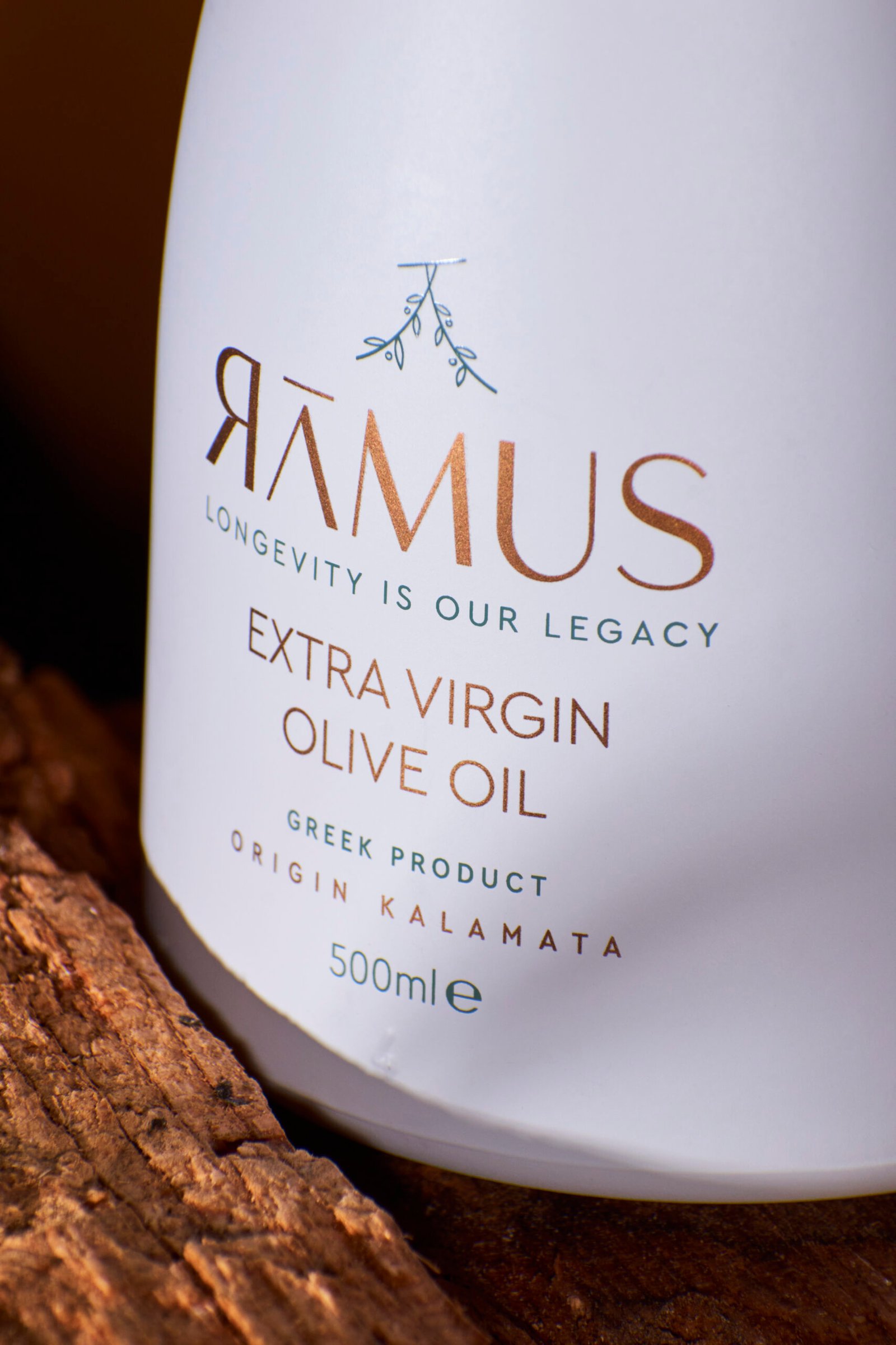
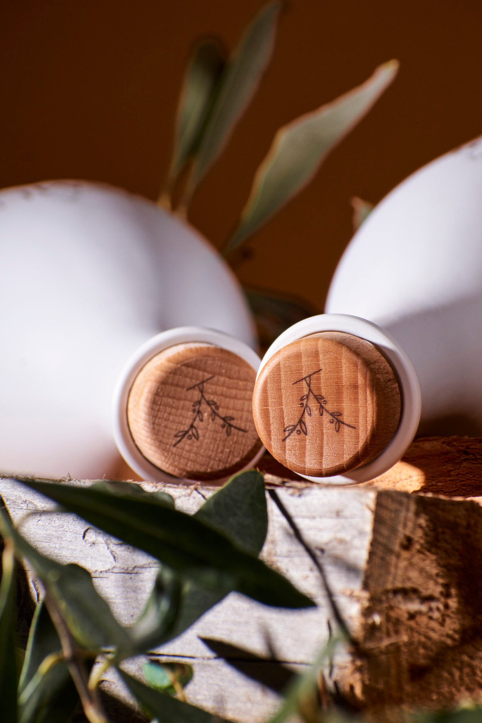
The icon design thoughtfully reflects the brand name, incorporating elements inspired by olive branches in a clean and modern way. The typography adds another layer of sophistication, featuring a specially designed “A” without the typical horizontal dash, instead placing it above the letter as a subtle accent, mirroring the icon itself. Additionally, the first “R” in “Ramus” is uniquely reversed, adding a bold and distinctive character to the logo while ensuring it stands out as truly one of a kind.
Βottle design
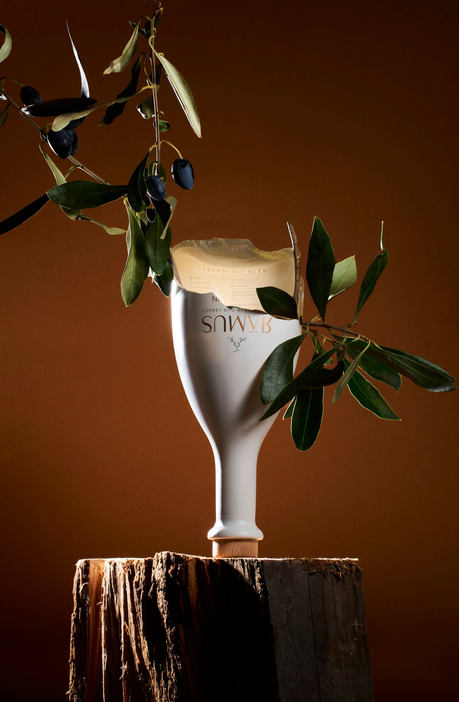
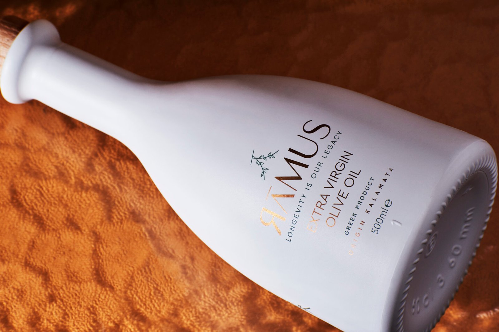
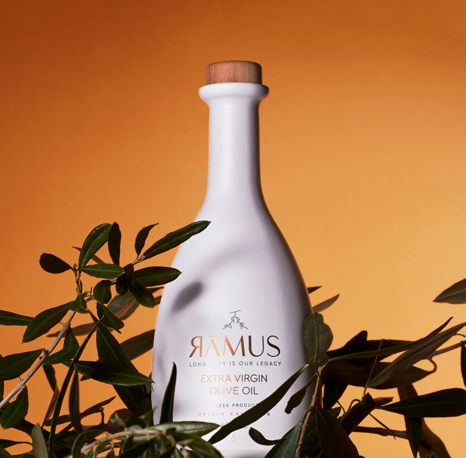
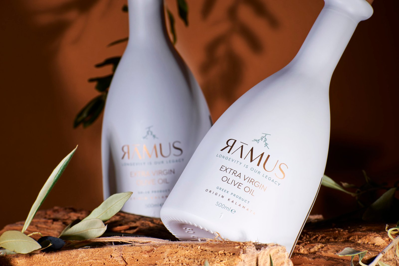
The bottle design is another highlight of the brand, resembling handcrafted ceramic, evoking both luxury and a connection to the ancient craftsmanship of the Mediterranean. Its minimalistic aesthetic is paired with premium finishes, such as matte textures, earthy tones, and fine detailing, emphasizing the exclusivity and high quality of the olive oil.
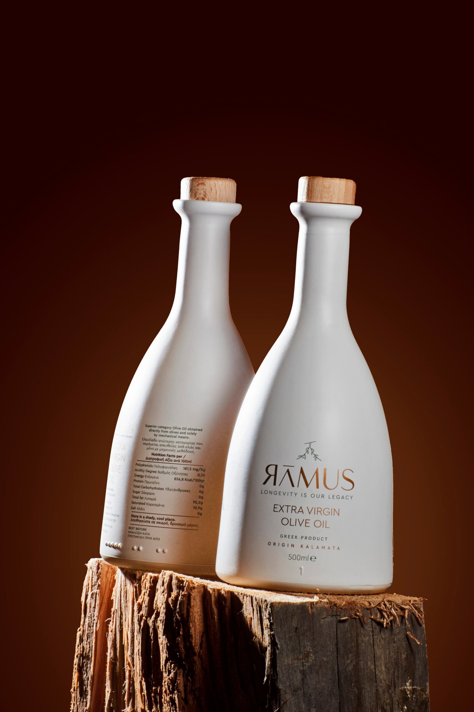
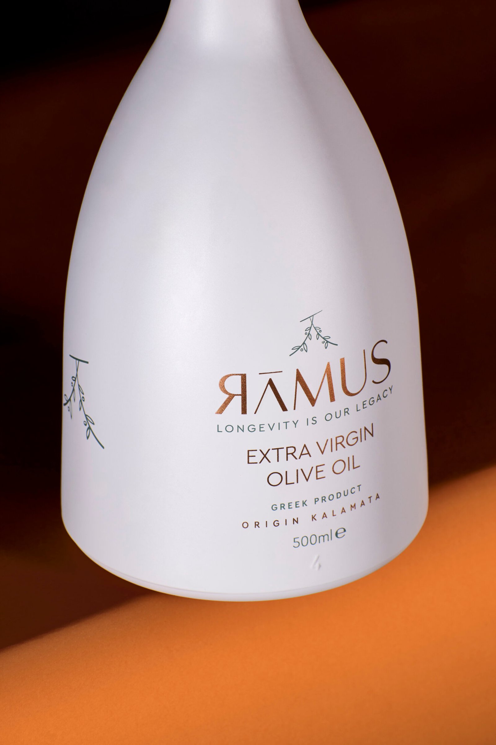
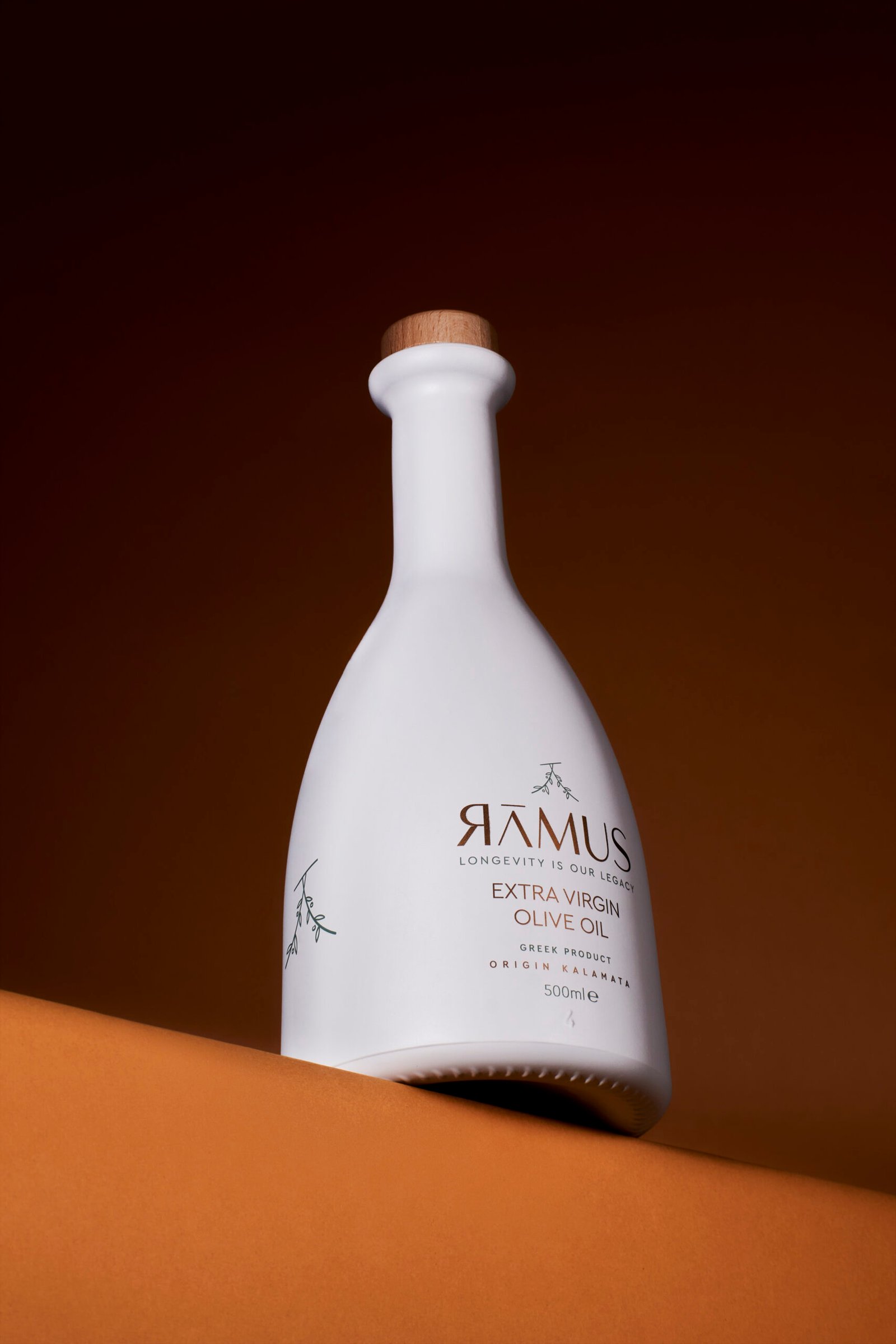
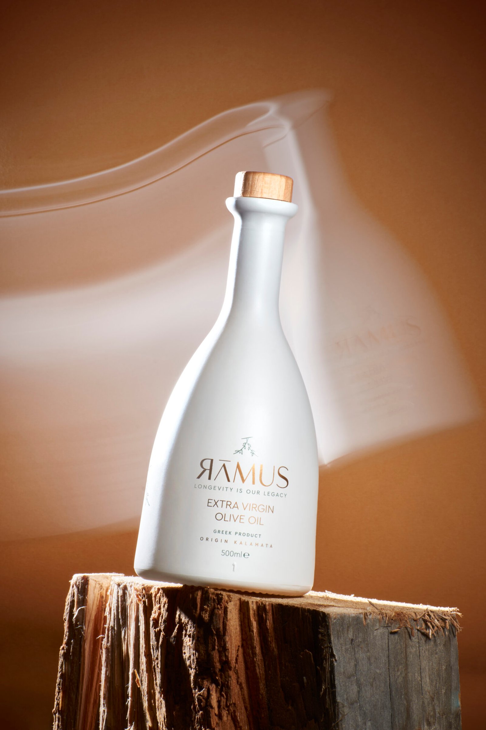
The branding is deliberately minimalistic, allowing the luxurious elements and the product’s authenticity to shine through. The color palette is inspired by natural hues — soft whites, olive greens, and subtle golds — further tying the design to its organic roots and premium positioning.
Ramus is more than just an olive oil brand; it is a refined experience that balances tradition with modern design, creating a product that is as visually stunning as it is exquisite in taste. From the elegant typography to the ceramic-inspired bottle, every element of Ramus reflects a commitment to artistry, authenticity, and luxury.