Eladion Taxiarches Olive Oil
Logo & Packaging for Extra Virgin Olive Oil
Eladion Taxiarches Extra Virgin Olive Oil is a family-owned brand established by the Kassiteropoulos brothers in Taxiarches, a picturesque village in northern Greece. The brand embodies tradition, authenticity, and a deep connection to the fertile lands of their estate near the village’s mountains. Their olive oil reflects the purity and richness of their heritage, offering a premium-quality product for olive oil enthusiasts worldwide.
Logo Concept
The logo draws inspiration from the Kassiteropoulos estate’s location, nestled amidst the rolling mountains surrounding Taxiarches. Clean, minimal lines depict the harmonious balance between nature and tradition. The design emphasizes simplicity and elegance, with deep green as the dominant color to symbolize lush olive groves and purity, complemented by white accents for clarity and sophistication.
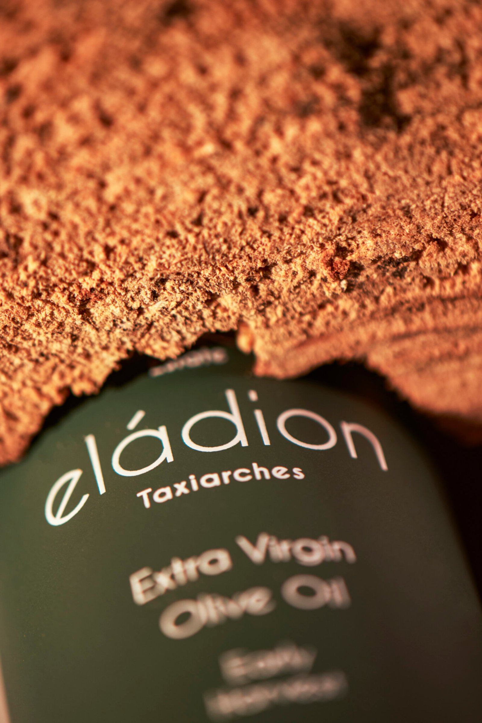
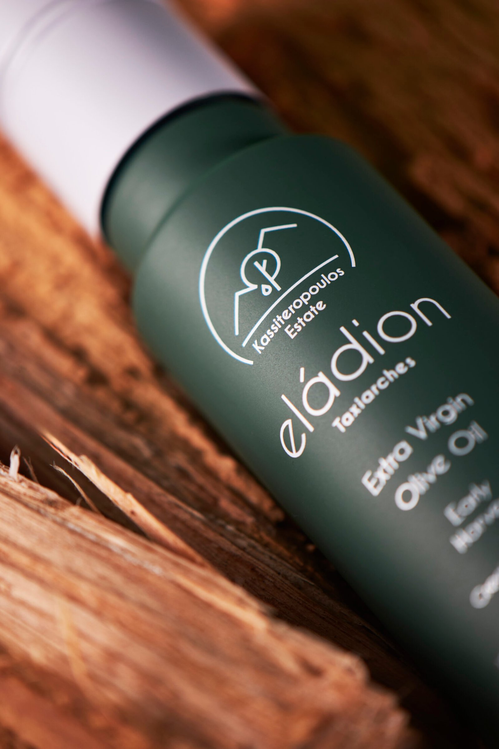
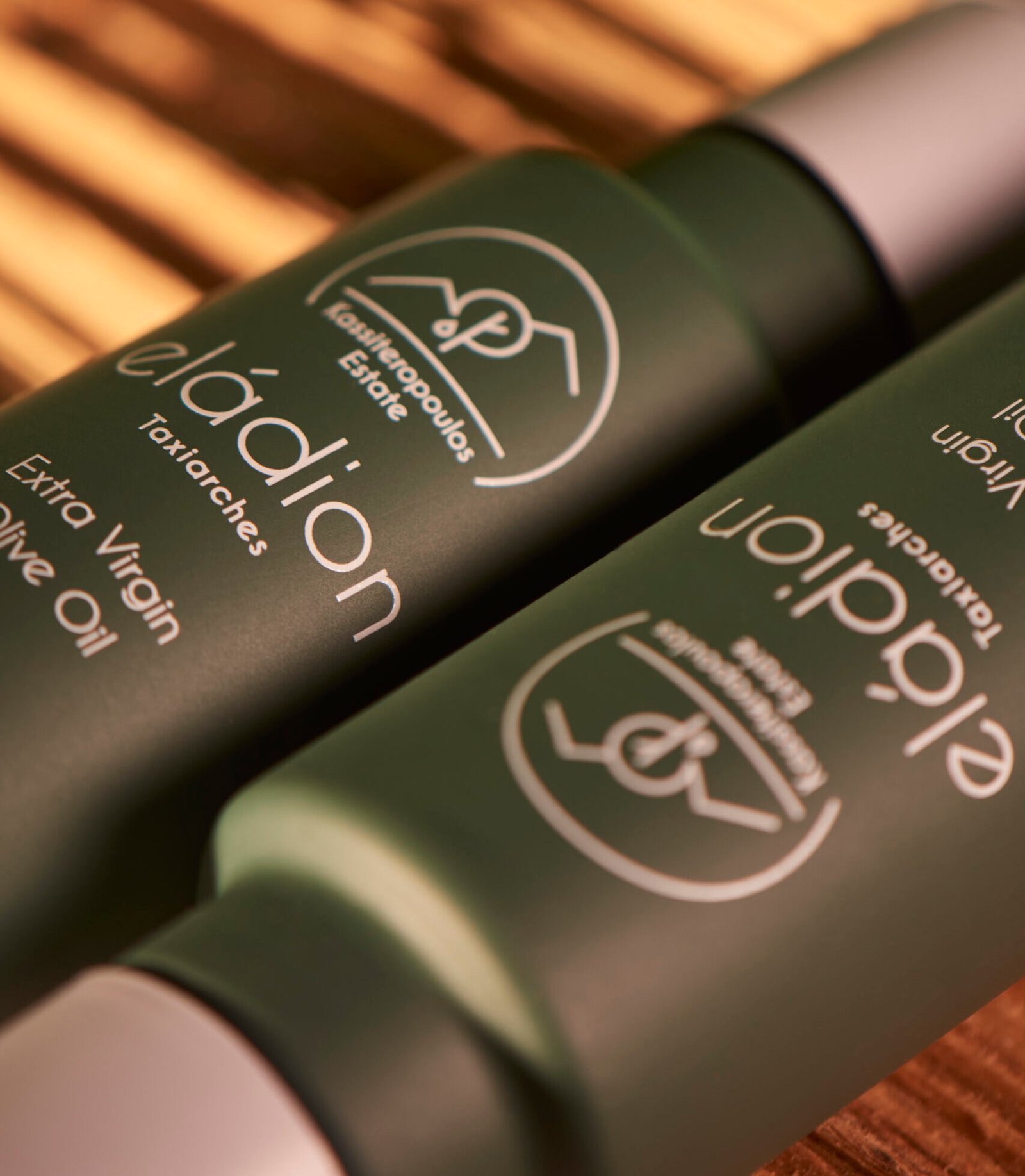
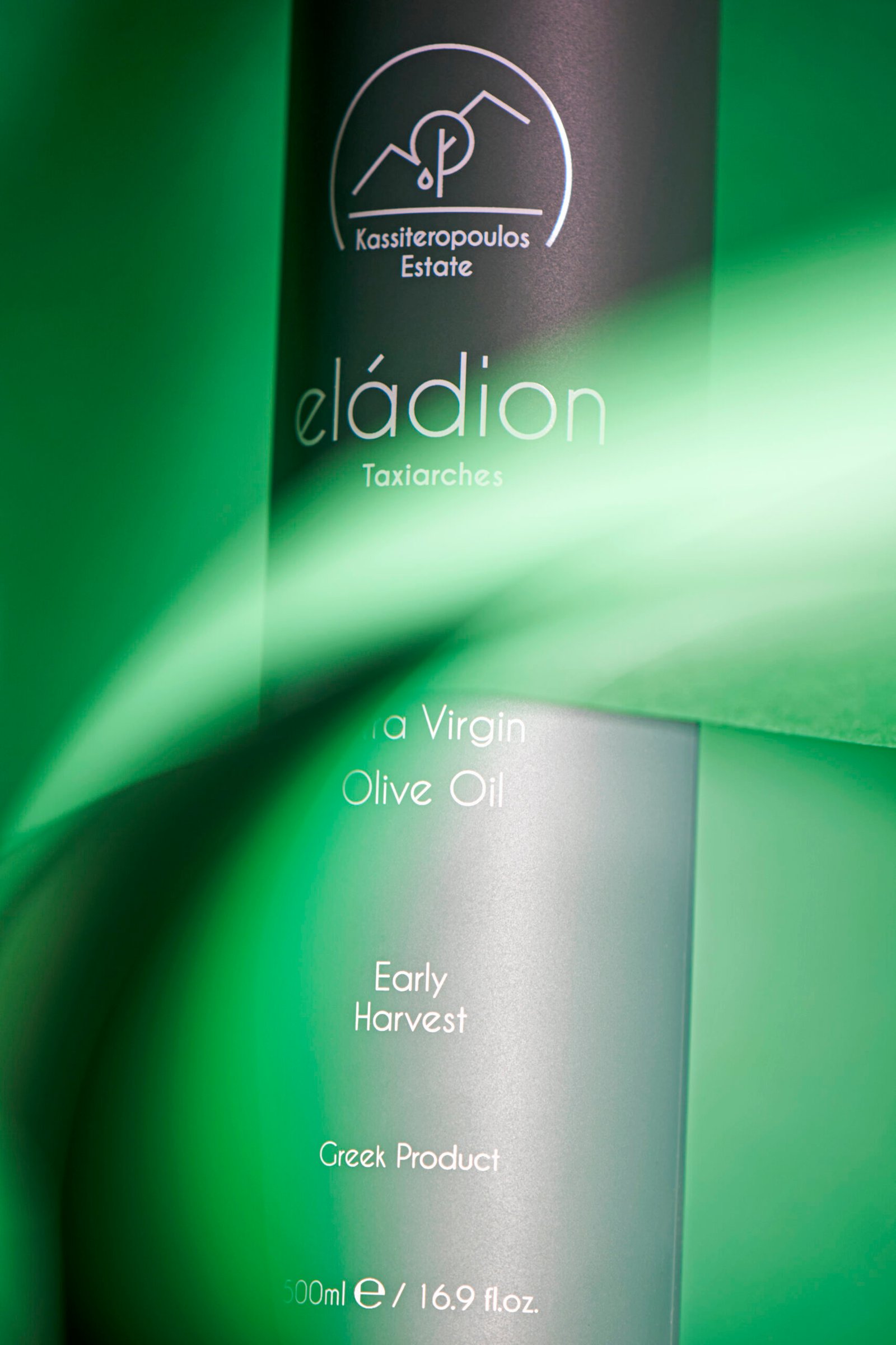
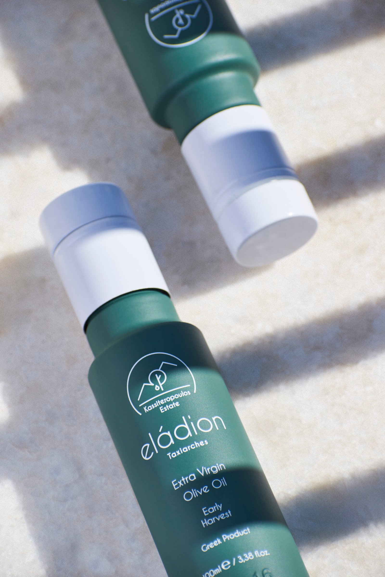
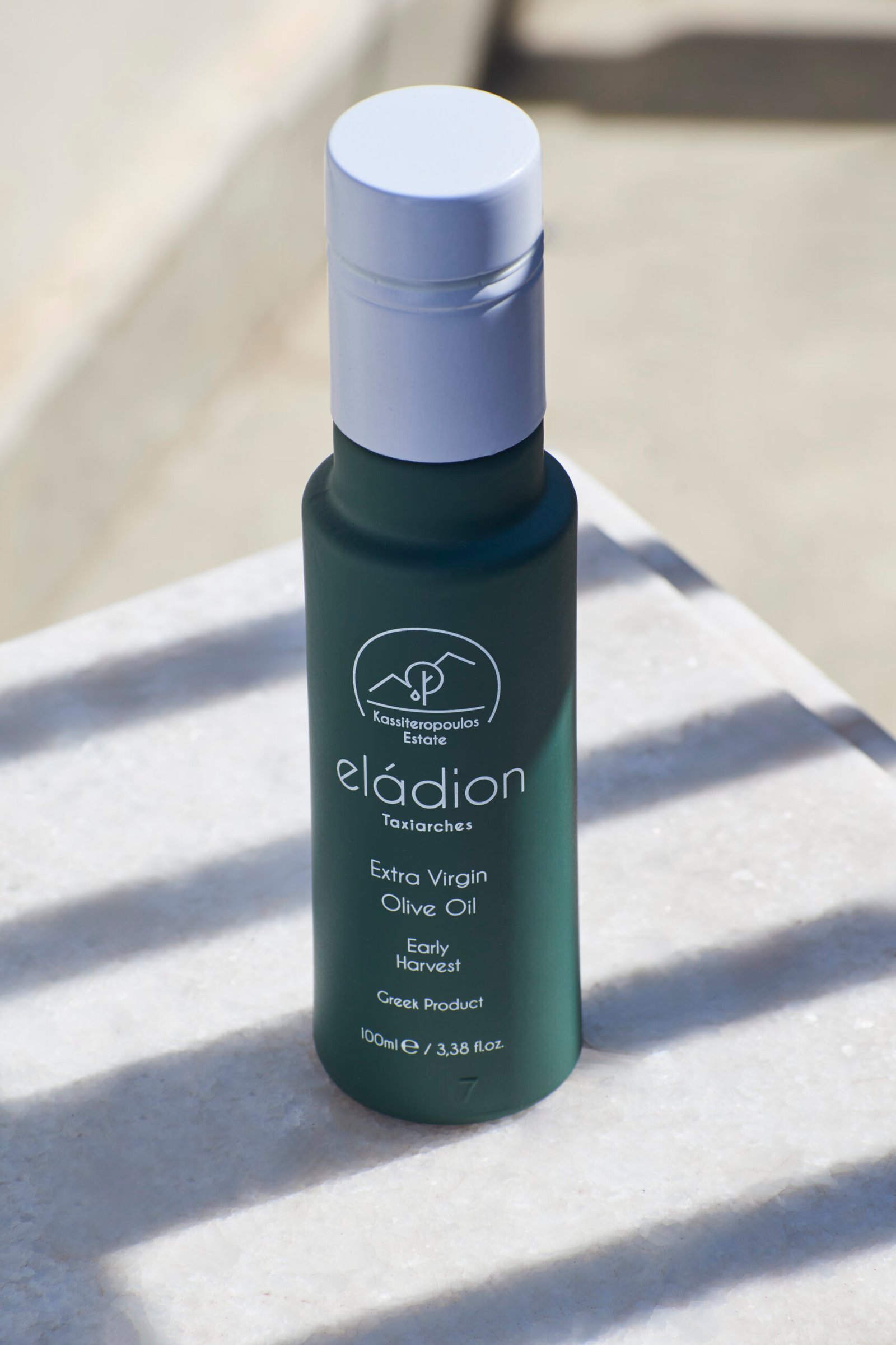
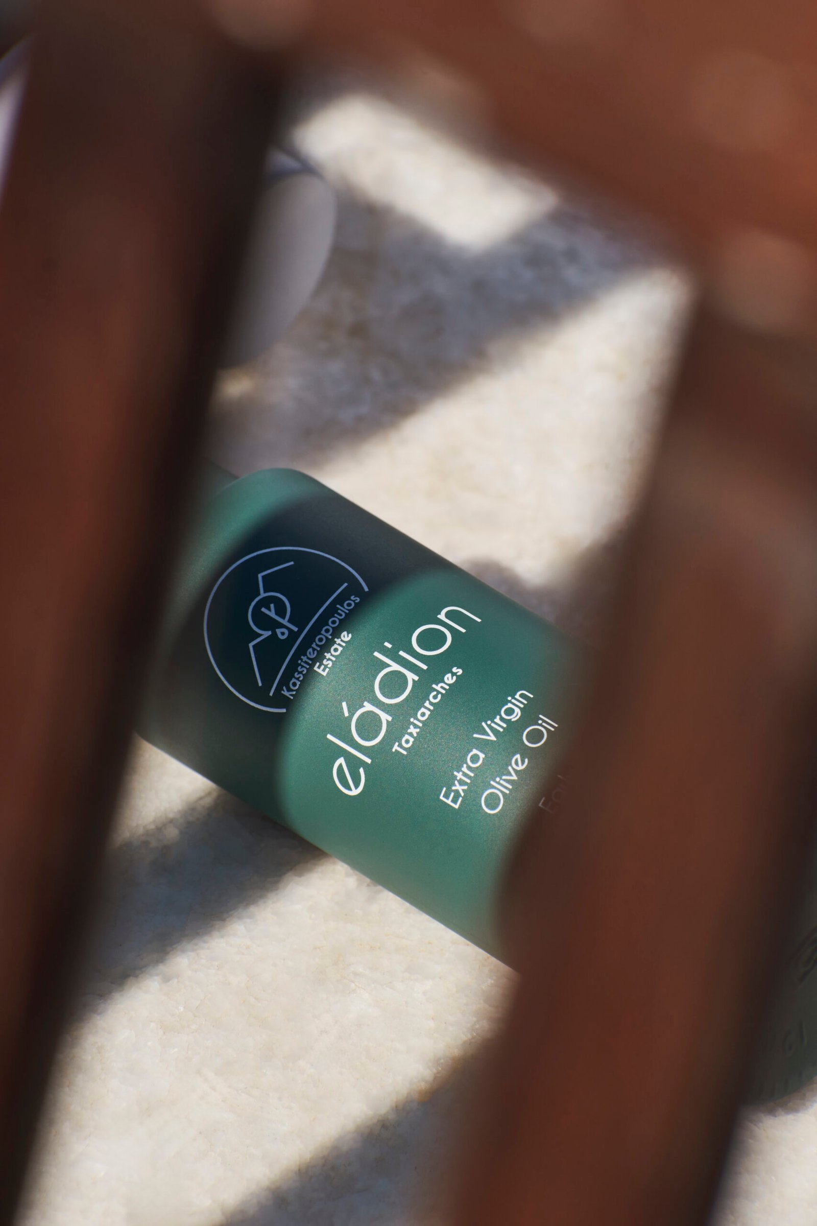
Βottle design
The olive oil bottle’s design is a reflection of the brand’s commitment to minimalism and refinement.
Color Palette
Deep green and white are the primary colors, creating a clean and premium look.
Typogaphy
Elegant, minimal typography in white contrasts beautifully against the green bottle, enhancing readability and aesthetic appeal.
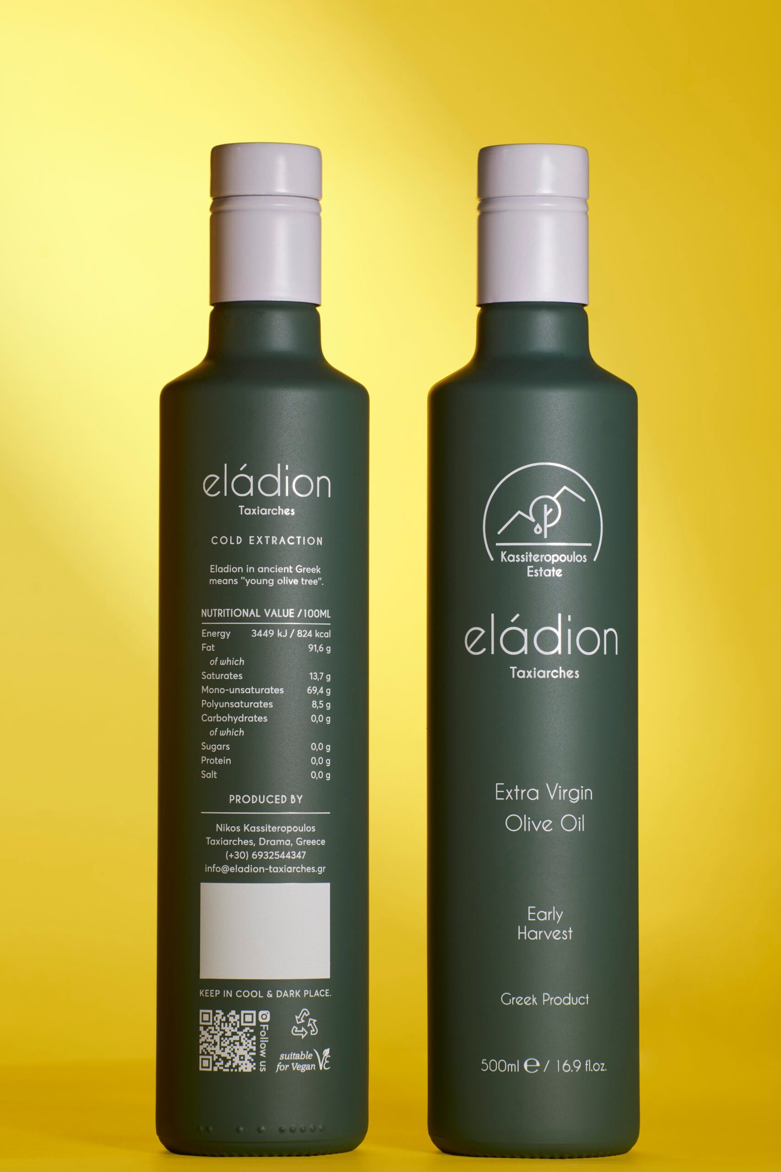
This branding approach combines the Kassiteropoulos brothers’ heritage, the pristine nature of Taxiarches, and the premium quality of their olive oil into a cohesive visual identity.
Photography
A huge thank you to Yiannos Maroulakis (@yiannosraw) for capturing the essence of this project with his incredible photography!