Liminal Inspired Engineers – Logo Redesign & Corporate identity

Brand Identity & Logo Redesign
For this project, I developed a fresh and cohesive brand identity for Liminal Inspired Engineers, incorporating a logo redesign that aligns with the company’s vision of innovation, precision, and modern engineering solutions. The updated identity reflects a balance between structure and creativity, reinforcing the brand’s professional and forward-thinking approach.
Logo Redesign
The new Liminal Inspired Engineers logo was designed to better represent the company’s core values and industry focus. Key improvements include:
• A refined geometric framework, symbolizing precision and engineered solutions.
• Minimalist typography, creating a clean and contemporary aesthetic.
• Balanced proportions, ensuring versatility across digital and print applications.
• A monochromatic color scheme, enhancing professionalism and timelessness.
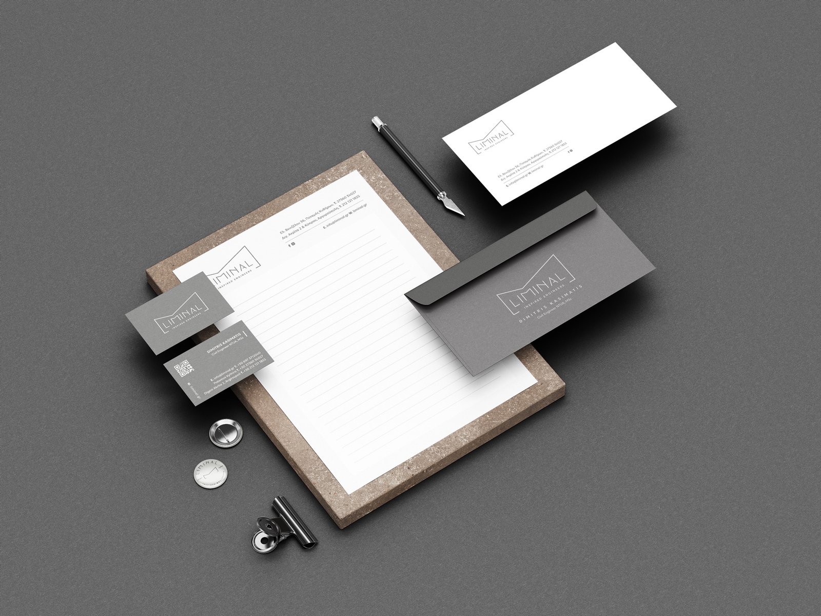
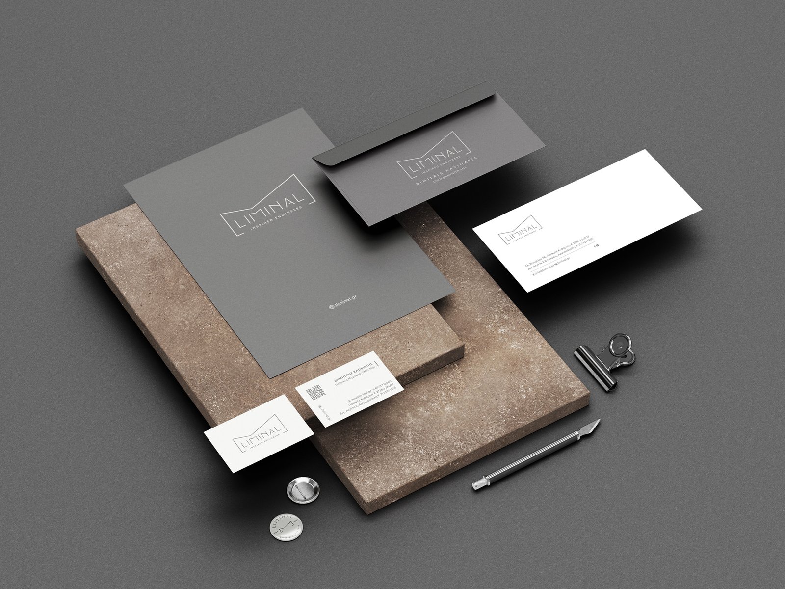
Branding Elements
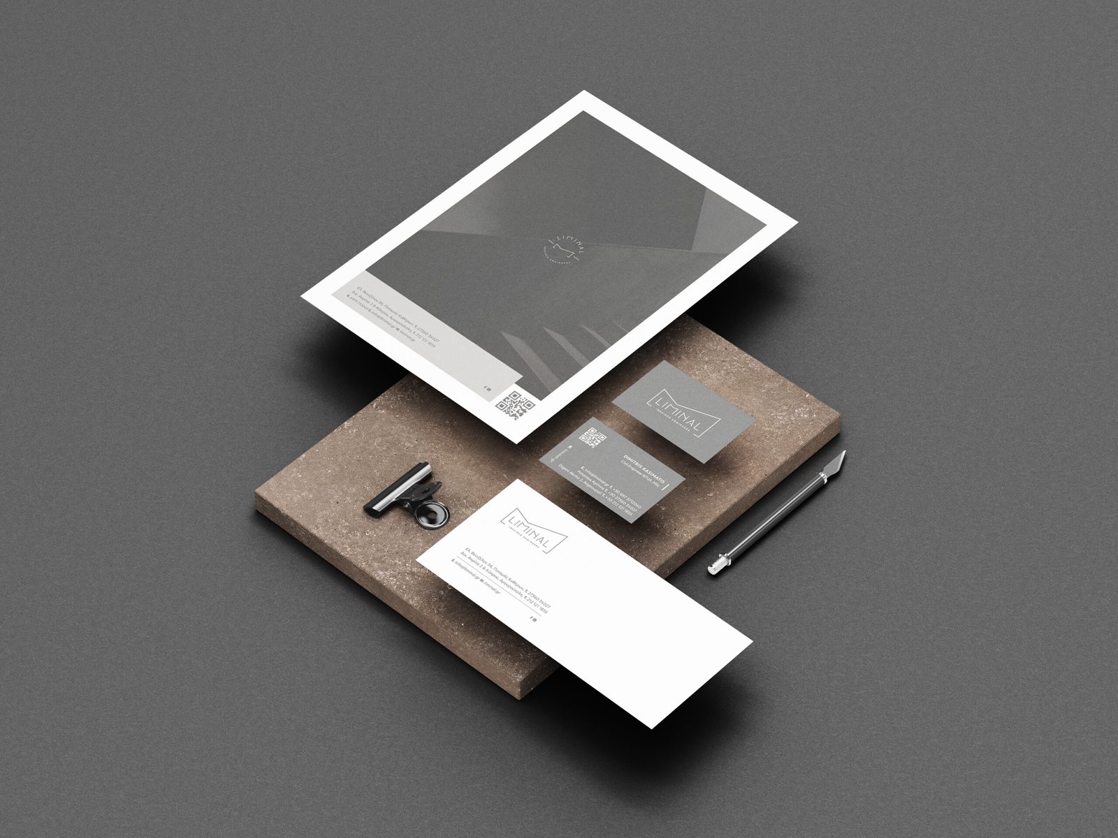
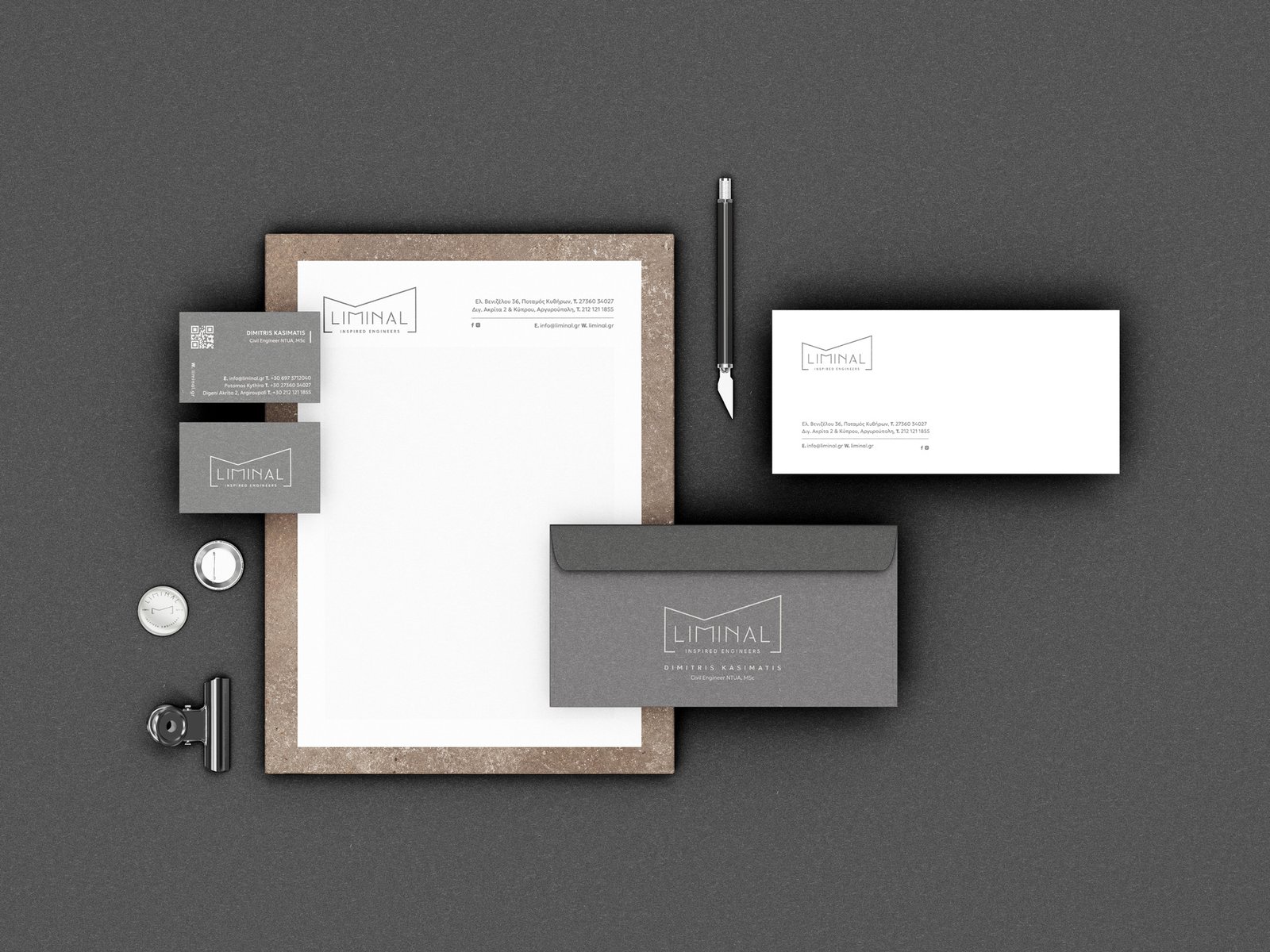
To create a seamless and impactful brand presence, the identity system includes:
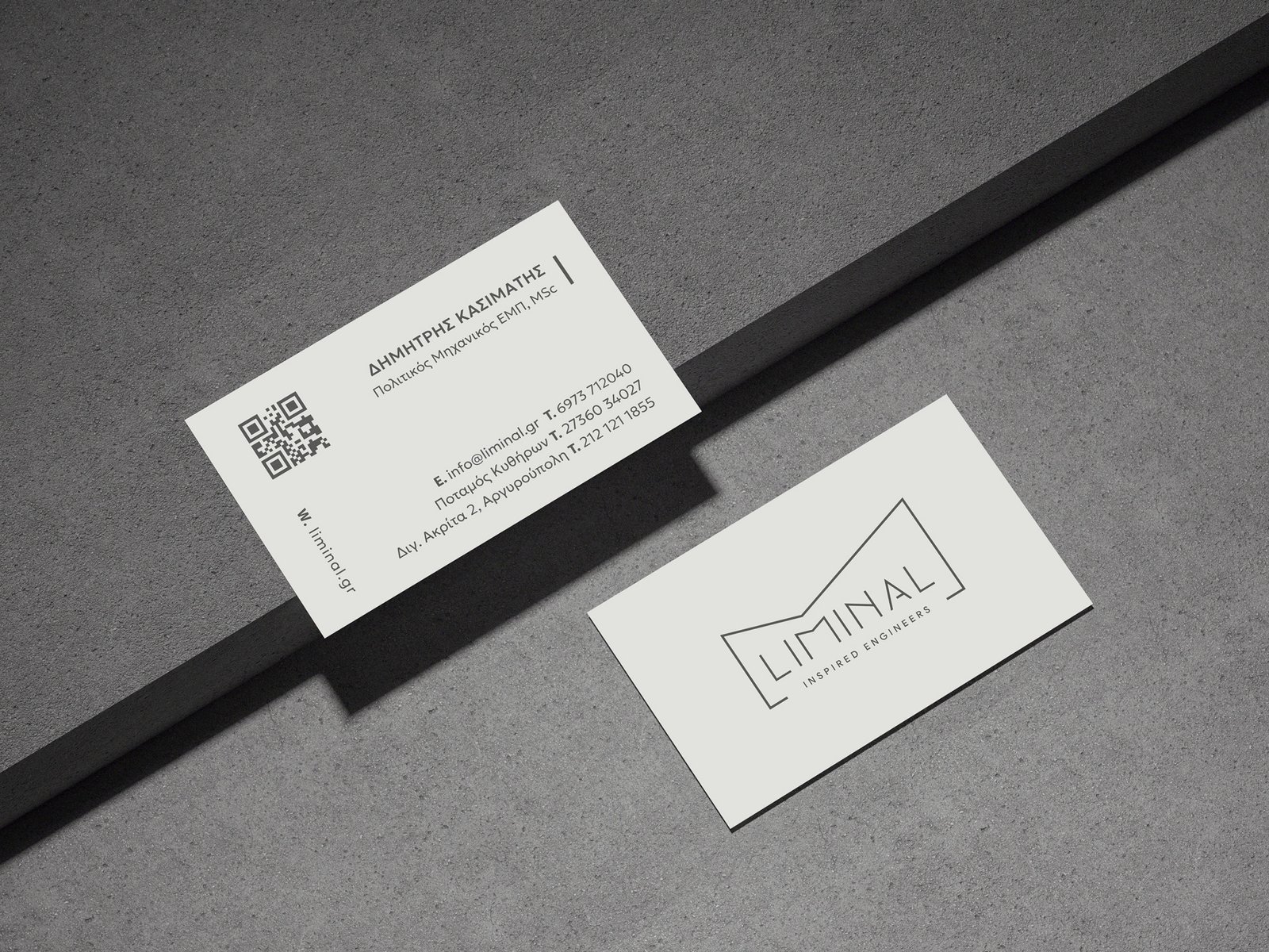
• Business Cards & Stationery: Clean, structured layouts that ensure consistency across corporate communications.
• Envelope & Letterhead Design: Designed for professionalism, featuring the redesigned logo prominently.
• Typography & Color Palette: A modern sans-serif typeface paired with a monochrome palette, reinforcing clarity and sophistication.
Outcome
The redesigned logo and brand identity establish Liminal Inspired Engineers as a modern, innovative, and trustworthy company. The new identity system provides a strong visual foundation that enhances brand recognition and reflects the company’s commitment to excellence in engineering.
