Alpha Omega LTD Constructions Logo
Alpha Omega Constructions LTD Branding
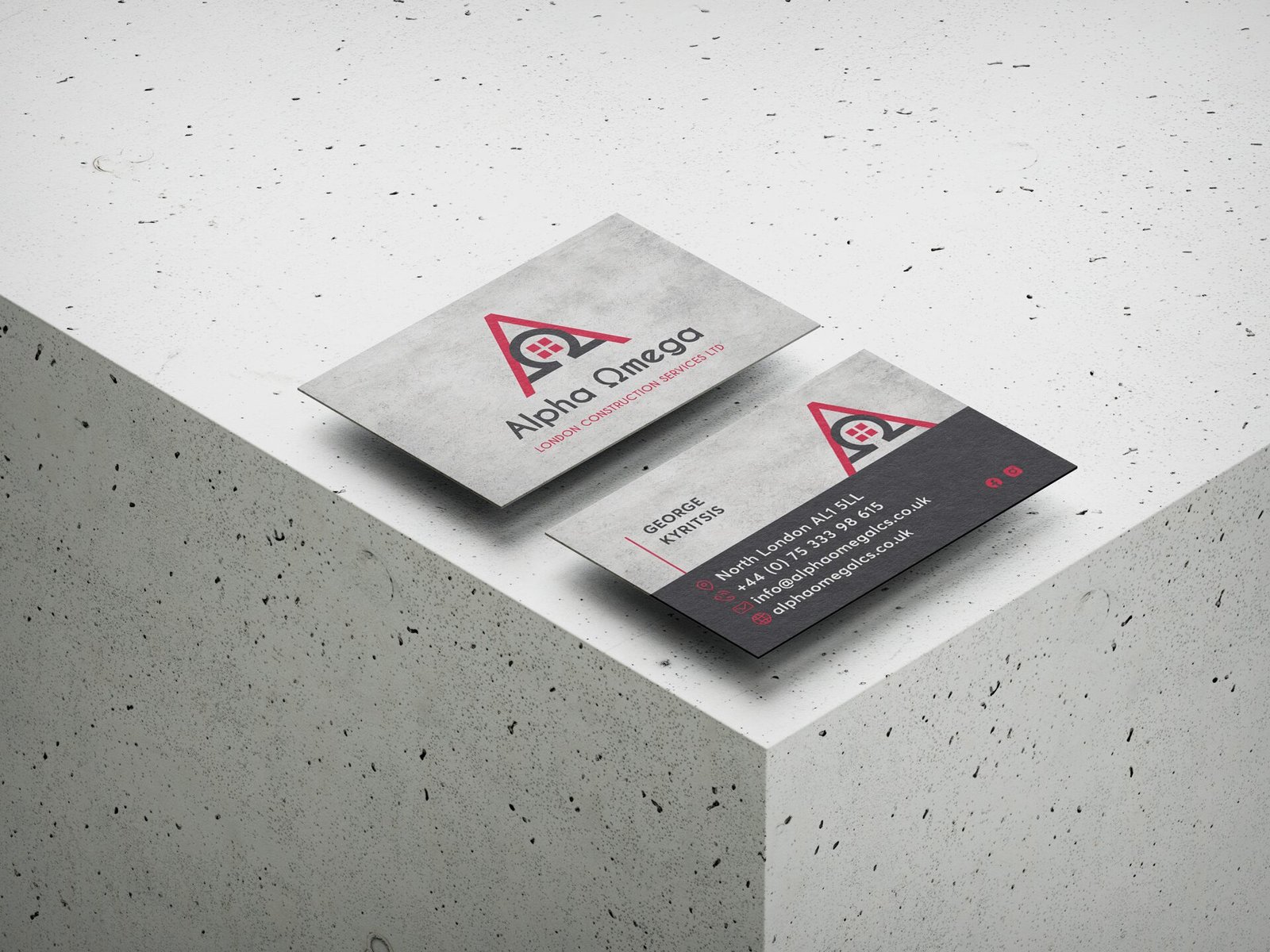
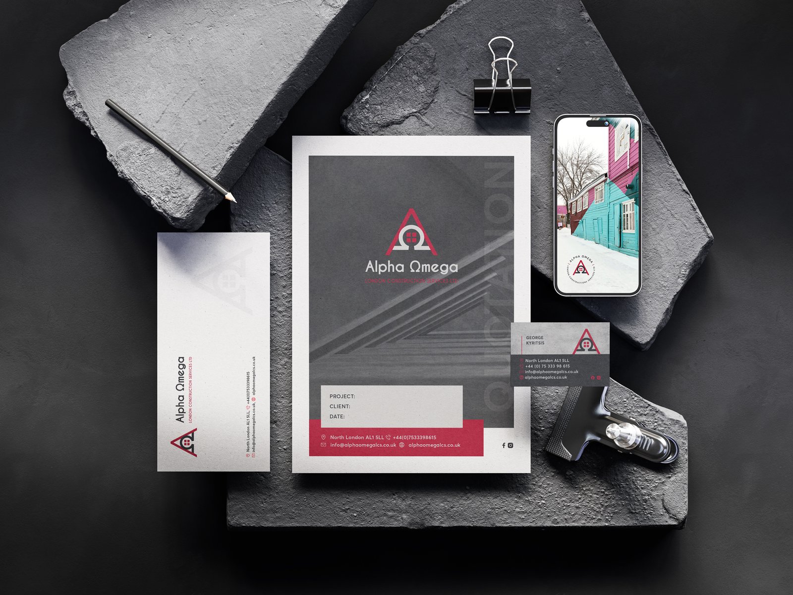
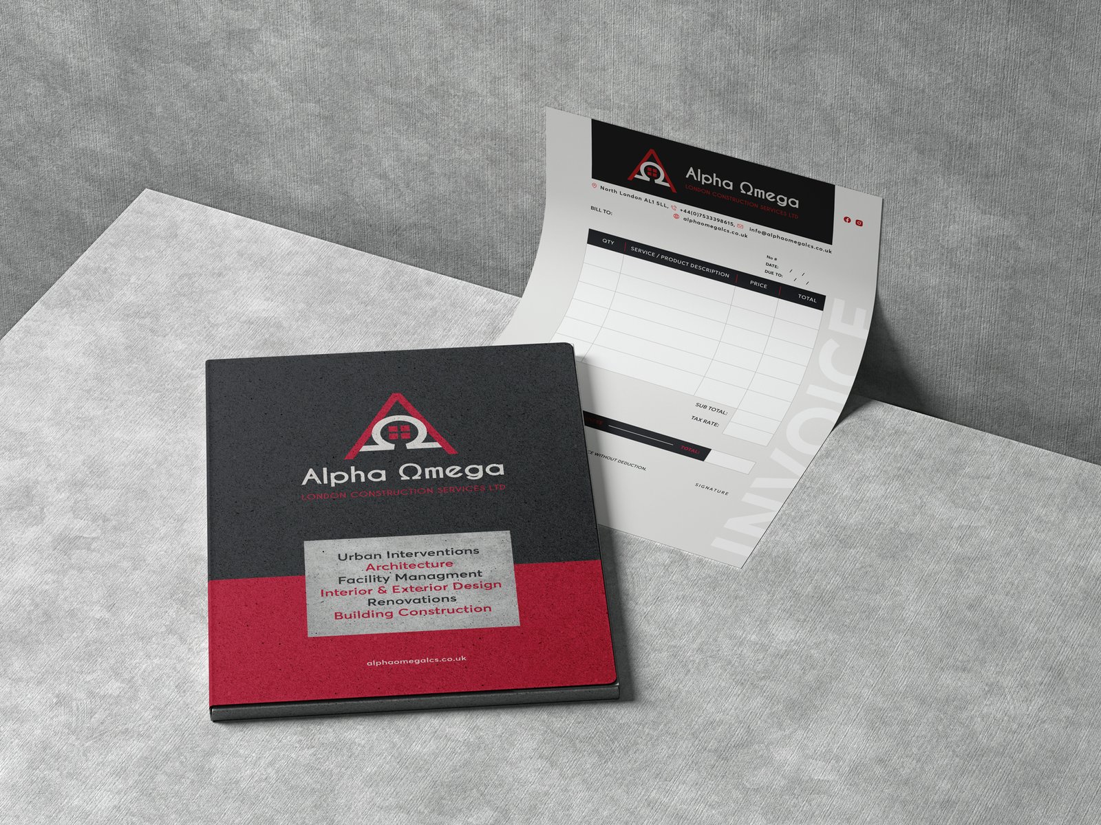
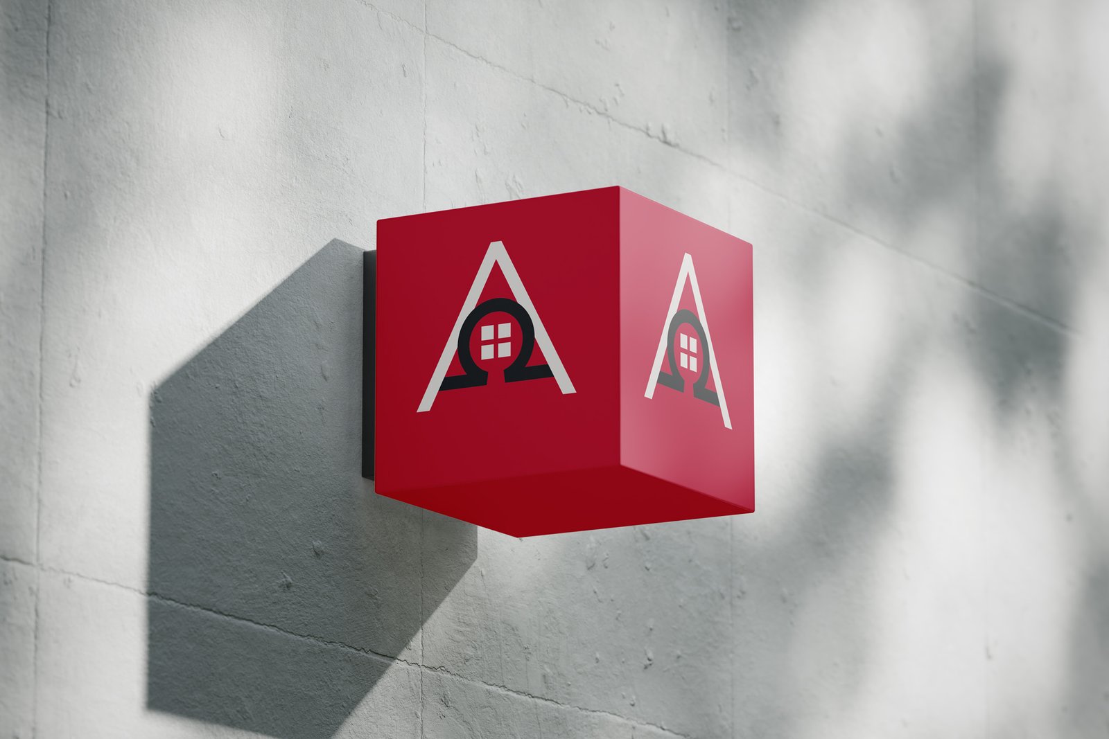
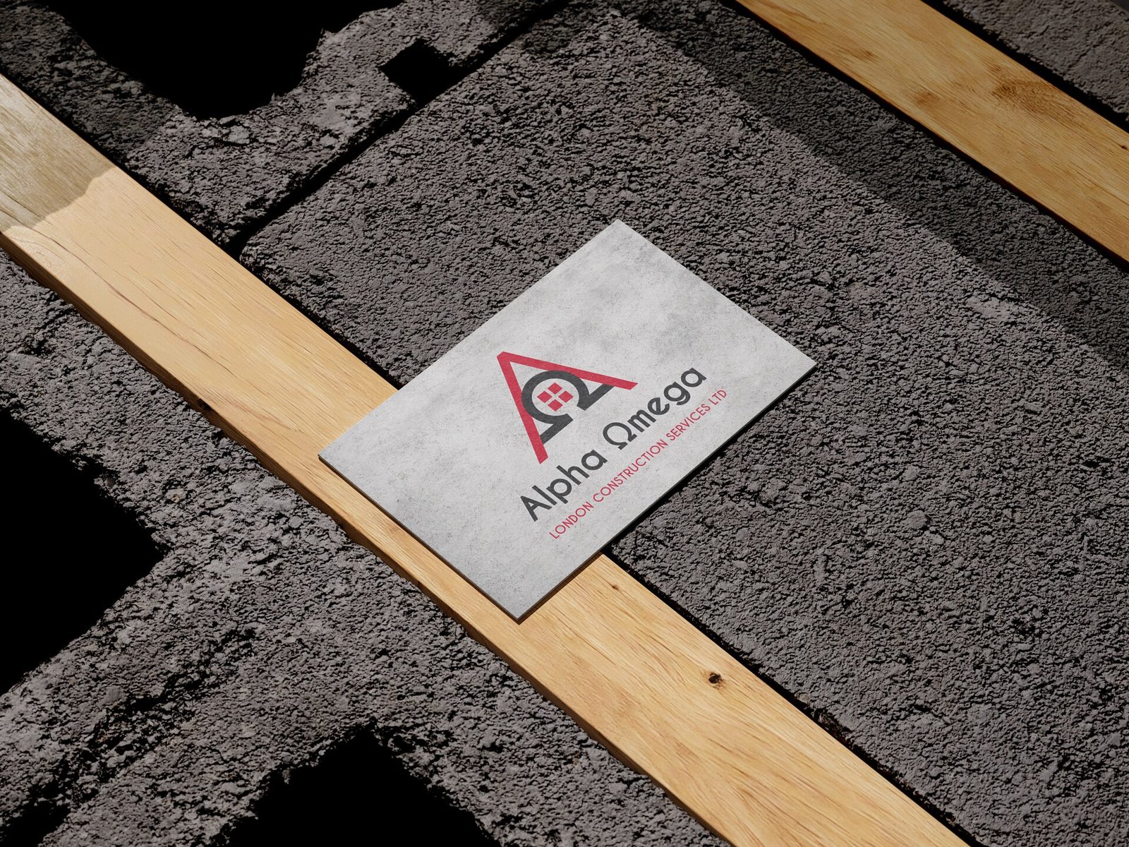
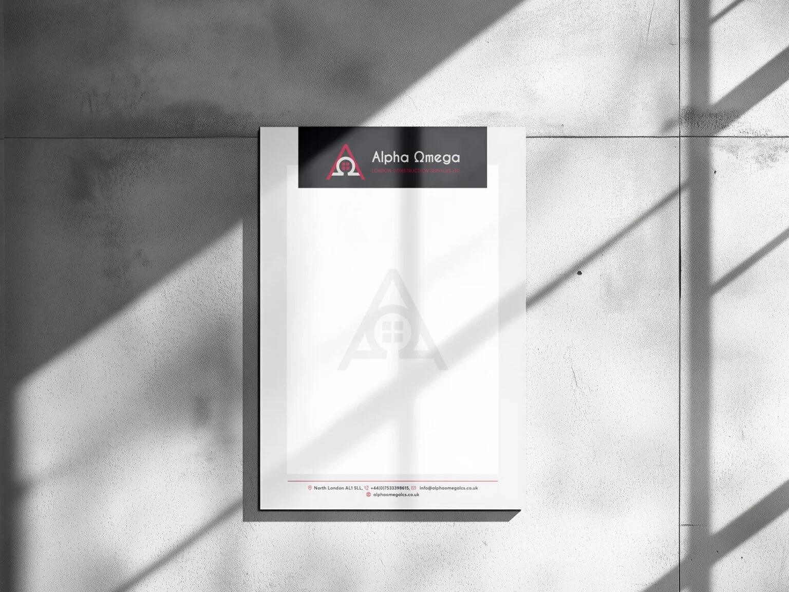
Alpha Omega Constructions LTD is a forward-thinking construction company offering complete and reliable services for both residential and commercial projects. The name “Alpha Omega” is deeply rooted in the Greek symbols Α (Alpha) and Ω (Omega), symbolizing the company’s philosophy of managing projects from start to finish with exceptional attention to detail.
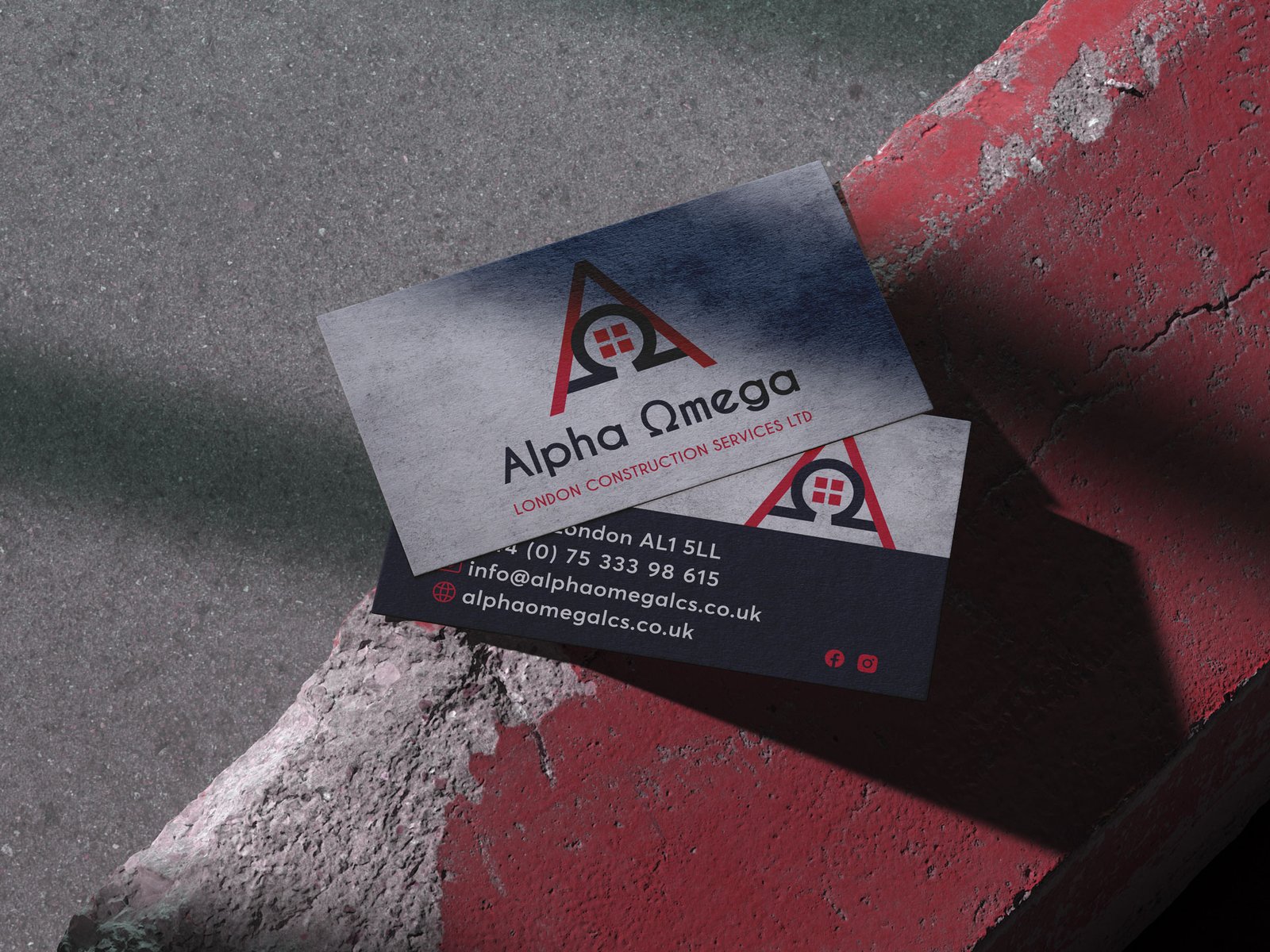
The logo is a synthesis of the Greek letters Α (Alpha) and Ω (Omega), combining them into a unified, modern design. Inside the logo, the concept of a window is subtly represented through four clean, rectangular shapes, symbolizing construction, structure, and vision. The combination of the letters and the window element visually connects the company’s identity to its core expertise in building and design.
The minimal yet powerful design reflects both innovation and the strong foundations upon which the company is built.
The integration of geometric shapes ensures the logo is memorable, versatile, and professional.

Color Palette
The branding features deer grey and red colors.
1. Deer Grey conveys stability, sophistication, and reliability.
2. Red Hues introduce energy, passion, and a dynamic approach to problem-solving and construction excellence.
Typography
The typography is sleek and modern, complementing the geometric nature of the logo while maintaining readability and professionalism.
This branding approach encapsulates the company’s dedication to delivering quality projects from beginning to end, while the unique logo design highlights their innovative perspective in the construction industry.